
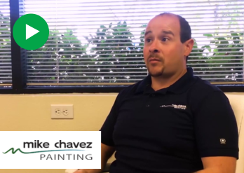
Why is Reputation Management Important for My Business?
Discover the importance of reputation management for businesses and learn about online reputation management, reputation management plans, and how to measure effectiveness.
We positively impact the lives of our clients beyond their KPI reports.
What unexplored possibilities await your business?


Generate high-quality leads and convert more customers.
Increase your visibility so customers can easily find you and your services.
Transform your customers into loyal advocates and promoters of your brand.
Turn your website into a powerful lead generator for your business.

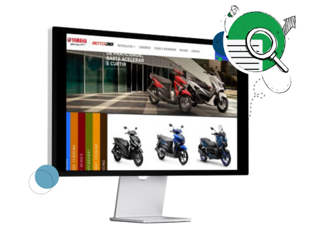
Moto 36 Yamaha partnered with WSI for a digital overhaul to overcome marketing challenges and increase online visibility, resulting in a strategic blend of social media and paid advertising campaigns. This strategic approach significantly increased targeted visitor traffic to their website, converting over 2,500 leads into 1,600+ sales and marking a 25% year-over-year sales increase. Yamaha's national office recognized their success, highlighting the effectiveness of WSI's innovative digital marketing strategy.

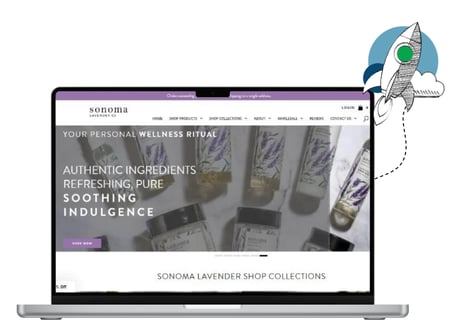
Sonoma Lavender, nestled between California's Mayacamus and Sonoma Mountains, faced challenges in expanding its market presence and online sales. Collaborating with WSI, they developed a comprehensive digital marketing strategy, focusing on social media ads, targeted paid campaigns, and SEO optimization. This multifaceted approach led to a 50% increase in online sales, an outstanding 700% surge in organic traffic, and significant market exposure, establishing Sonoma Lavender as a competitive wellness and lifestyle industry leader.

Download Sonoma Lavender's case study to read their full story and envision your brand's growth with WSI.
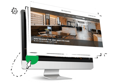
Blake Bush Family Eye Care, serving Ardmore, Oklahoma, transformed its digital approach with WSI's expertise, skyrocketing patient bookings by 400%. A new, responsive website, enhanced with local and organic SEO tactics, attracted a wider audience, resulting in a 61% increase in overall traffic and a 33% rise in organic visitors. This strategic overhaul not only won a WMA WebAward for Outstanding Website but also ensured 16% of site visitors scheduled appointments, with 94% booking on their first visit, demonstrating the power of targeted digital marketing in healthcare.

Read what we did for Blake Bush Family Eye Care and how we could do the same for you.

Digital marketing tips, tricks, and best practices you can put into action.
Discover the importance of reputation management for businesses and learn about online reputation management, reputation management plans, and how to measure effectiveness.
Discover how WSI leverages AI technology with new suppliers to enhance digital marketing services. Unlock possibilities ...
Learn how to navigate the post-third-party cookie world in digital marketing. Explore strategies like first-party data, contextual advertising, and AI to stay ahead in the evolving landscape.